Today, I would like to share a bit more than just the final piece. I am going to share the steps i used to arrive to the final lettering, in terms of composition and colors. That way, you can learn more about my work & thought process.
___

Step 1:
___
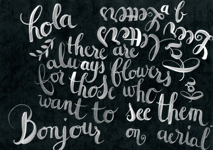
Step 2: I tried a white ink on black paper to see what it looked like, but i came back to the watercolors because I didn't think it fitted the quote. I wanted something light.
___
Step 3: I took the same quote, but put it in french, just because normally I only do English, so for a change! I tried some different combinations of watercolors and really liked what happened in the words "les voir", so i kept these colors as reference.

___
Step 4: Another tryout similar to step 3.
____
Step 5:
I quite like the floating composition of this one, but there are still things that don't look nice. The words "les voir" is too much on the left and leaves a big white space under "veut bien". Let's try to improve that. Of course i could move the words in Photoshop, and i usually do some Photoshop to makes things look more harmonious, but this time, i am going to play the game fully :)

___


Final piece: I am quite happy with this final composition and colors, so I stopped there. Of course, you can always make everything better and perfection it, but it is also nice to be able to stop at some point.