Olive-tree
I have been working with new tools lately and this experiment with my calligraphy nib to draw is something i will work on further. I like how fine the lines are coming out.

I have been working with new tools lately and this experiment with my calligraphy nib to draw is something i will work on further. I like how fine the lines are coming out.


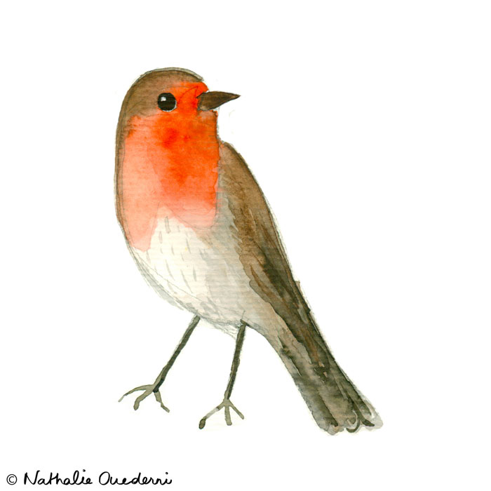

If i haven't posted in a while, it is because i am being busy with my study (a course to learn how to build websites and apps), and with a fun project of lettering for a magazine of New York. In the meantime, I have been able to paint some little birdies. I hope you will like them.
Today, I would like to share a bit more than just the final piece. I am going to share the steps i used to arrive to the final lettering, in terms of composition and colors. That way, you can learn more about my work & thought process.
___

Step 1:
___
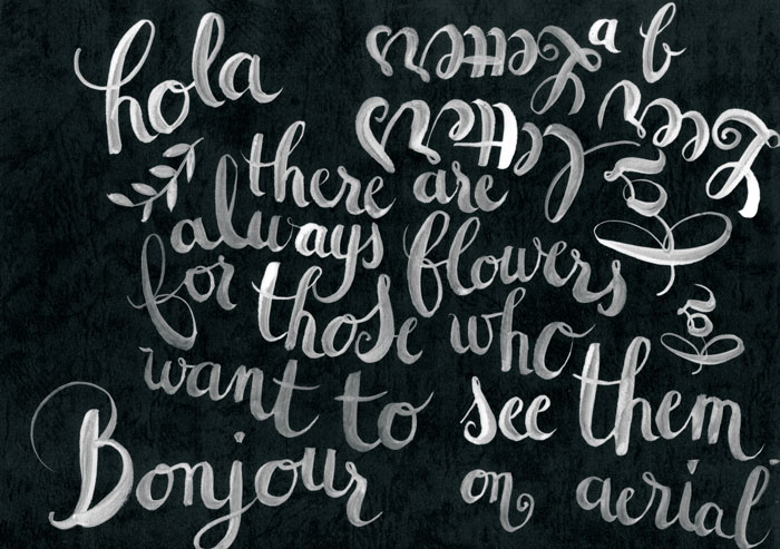
Step 2: I tried a white ink on black paper to see what it looked like, but i came back to the watercolors because I didn't think it fitted the quote. I wanted something light.
___
Step 3: I took the same quote, but put it in french, just because normally I only do English, so for a change! I tried some different combinations of watercolors and really liked what happened in the words "les voir", so i kept these colors as reference.

___
Step 4: Another tryout similar to step 3.
____
Step 5:
I quite like the floating composition of this one, but there are still things that don't look nice. The words "les voir" is too much on the left and leaves a big white space under "veut bien". Let's try to improve that. Of course i could move the words in Photoshop, and i usually do some Photoshop to makes things look more harmonious, but this time, i am going to play the game fully :)

___


Final piece: I am quite happy with this final composition and colors, so I stopped there. Of course, you can always make everything better and perfection it, but it is also nice to be able to stop at some point.

I saw this advert in a magazine the other day, and i took a picture as a reference for an eventual illustration.
Here you can see what i did with it:


I discovered recently an amazing illustrator and pattern designer, Moniquilla (http://masmoniquilla.blogspot.com.es). She makes repeat patterns with watercolor, markers, colored pencils,... and later applies it to textiles, iphone cases, notebooks, etc. She seems to be able to clone herself, when you see how many things she does! Anyway, i found an online course from her on how to make repeat patterns, and below is what i came up with. We had to think about a final product for our pattern, and i chose an olive oil packaging. Now that i am living in Spain, i discovered how important this ingredient is in their diet. I really love it! But i am always a bit disappointed in the bottle designs in the supermarket. So i decided to lift it up and applied the pattern i designed to a glass bottle.